GitHub API + Python + GnuPlot = Issue Count Graphs
Today I played a bit around with Python, a nice library for the GitHub API and fetched some data. Then I unleashed the power of GnuPlot and plotted some overall count graphs for our open and closed issues. They are slightly wrong - I simply ignored reopen and close events in between.
The source can be found at MorrisJobke/github-issue-counter where also a more detailed usage guide can be found.
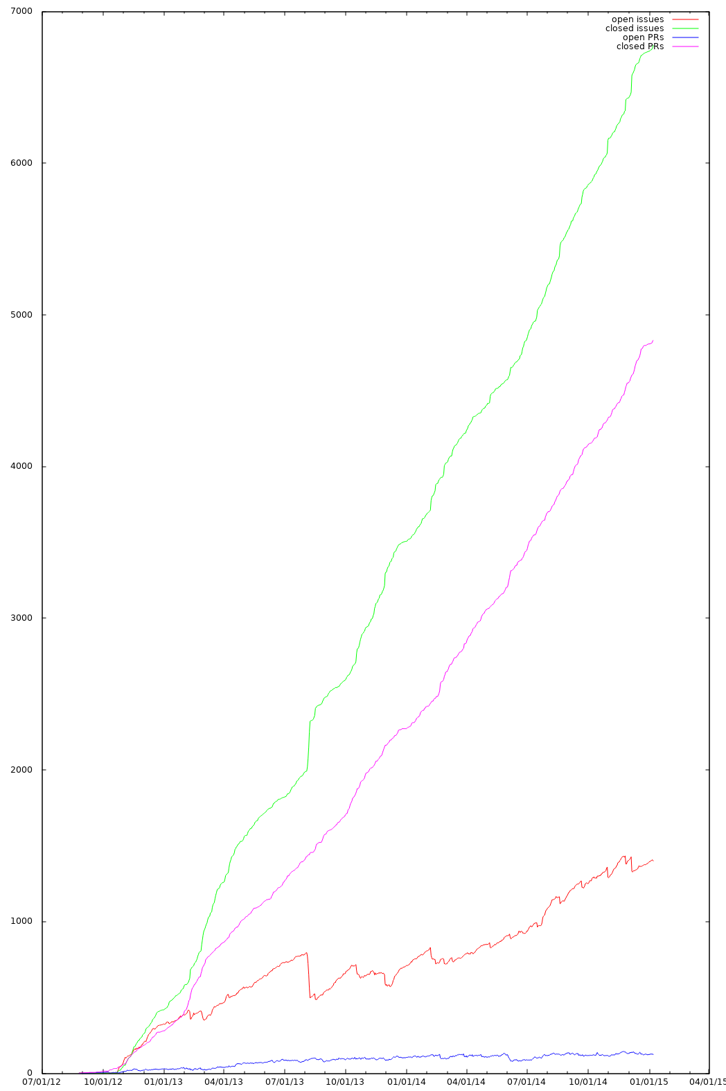
I used it to visualize the total issue count per day for owncloud/core and to not have the relative values listed on GitHub. With this you’re able to compare it more easiely with earlier stages of the project.
This is how the resulting data looks like after plotting it with gnuplot.
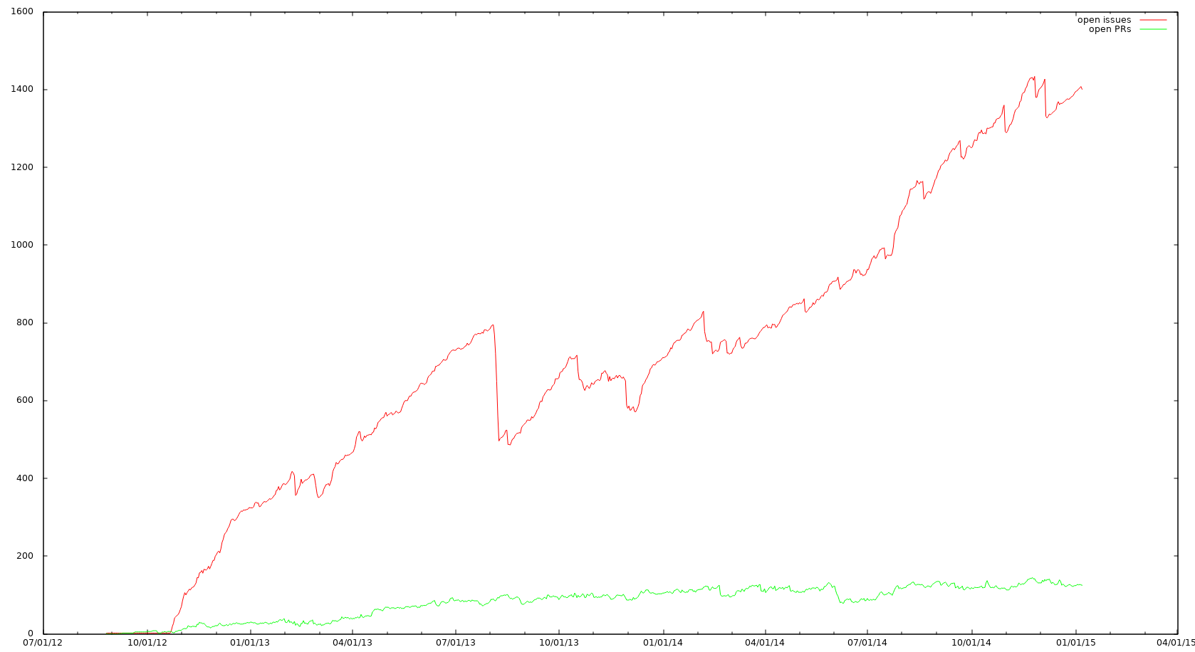
I really like the negative spike at the ownCloud conference of 2013 :D I guess this is caused by our bug hunting competition and Jan won it with something over 100 closed tickets back then ;)
Together with the closed issue count this looks like this: